In a major shift signalling a new era for one of the NRL’s most recognisable clubs, the Brisbane Broncos are poised to debut a redesigned logo—their first significant rebrand in a quarter of a century.
The updated emblem, submitted to IP Australia for trademark registration last Wednesday, features a sleek shield outline retaining the team’s hallmark bronco horse.
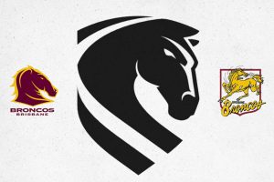
Though currently filed in black and white, the final version is expected to incorporate the team’s traditional maroon, white, and yellow colours.
NEXT: Staggs’ Retention Now Crucial: Four Things Learnt in Broncos’ Derby Decisive Triumph
NEXT: Payne Haas Set to Shun Free Agency with Multimillion-Dollar Broncos Deal, Rejects Perth Move
A club spokesperson confirmed the move, stating, “A newly created corporate design was recently submitted to IP Australia. The design has not been approved, accepted or registered at this point.” She declined to say whether the design would appear on team jerseys in 2026.
The current logo, introduced in 2000 and tweaked in 2006, has long been a staple of Brisbane’s brand identity. The new design hints at a return to the club’s roots, with the horse’s head appearing to echo the original 1988 crest—an homage to the year the Broncos entered the then-NSWRL competition.
Griffith University sports marketing expert Jason Doyle described the updated look as “less busy” and more digitally versatile.
“It has a bolder, more dynamic feel,” he noted, pointing out the subtle ‘B’ shaped into the horse’s nose. However, he warned against frequent visual changes: “Simple and consistent branding stands the test of time in sport.”
University of Queensland Associate Professor Sheranne Fairley added that the impact of a brand refresh often depends on a club’s history.
“The Broncos, being relatively modern since their 1988 inception, may have more flexibility to evolve,” she said.
Fairley speculated the logo’s horizontal stripe could symbolise the Brisbane River, reinforcing the city’s “River City” identity. Both experts agree that while modernisation is valuable, preserving tradition remains crucial.
As the Broncos look to modernise while paying homage to their past, fans now wait to see whether the new logo will become a fixture on the field—or remain a corporate identity experiment.
Either way, the rebrand marks a significant chapter in the club’s evolving story.